Quick overview of Adobe XD vs Sketch
In today's digital age, customer acquisition is the key factor for the success of any business. The experience of the user when visiting the website of your business determines whether you have a continued association with the customer. A lot of companies today are investing quite a bit into designing the user interface. As developers, our most important aid in determining user experience is the user experience design tool that we choose.
Until recent times the UI design tool market was dominated by two giants, the photoshop and the sketch. Since the photoshop is not a tool that was originally designed for UI development, sketch always seemed to lead the way. Last year adobe decided to put an end to this lag by announcing, 'the project comet'. In march, this year adobe launched the demo of this product with a new name, 'Adobe experience designer' or Adobe XD.
Say Hello to Adobe XD
Adobe XD is promoted as the first all in one tool for UI developers. The journey from wireframes to interactive prototypes has been made immensely simple with this tool. Adobe XD it enjoys the unfair advantage of seamless integration with Photoshop and integrator. The Photoshop and integrator are the most common design tools currently used by all designers, thereby giving the adobe xd a huge advantage in terms of customer familiarity and preference.
What's so cool about the Adobe xd?
Seamless integration with your photoshop.
As already mentioned, the seamless integration with photoshop and illustrator remains as the biggest advantage of this software. The integration is so simple that you can directly copy paste your photoshop cc and illustrator cc assets in HQ
Video Walkthrough
Creating an amazing UI is just the beginning of creating great user experience. Conveying the features of your design to the stakeholders is equally important. Adobe xd allows you to record a .mov file as you move through the various steps in your preview. This video can be shared with your team and stakeholders for more effective communication.
In-App Prototyping
The general market has provided a positive feedback for adobe xd so far. The well designed, easy to use interface is making the adobe xd a worthy opponent for the acclaimed sketch. The ability to toggle between development and prototyping without leaving the application is a great advantage for adobe xd. This particular feature in adobe xd is going to make the product standout in terms of ease of use for the designers.
Prototyping becomes more fun
Once the designing phase of your application is done,it's time for prototyping. The prototype of your design allows you to practically demonstrate the power of your design to all the developers and the stakeholders. Adobe xd has brought in a new life to the prototyping process. Small changes made to the prototyping process has made it much more fun to deal with.
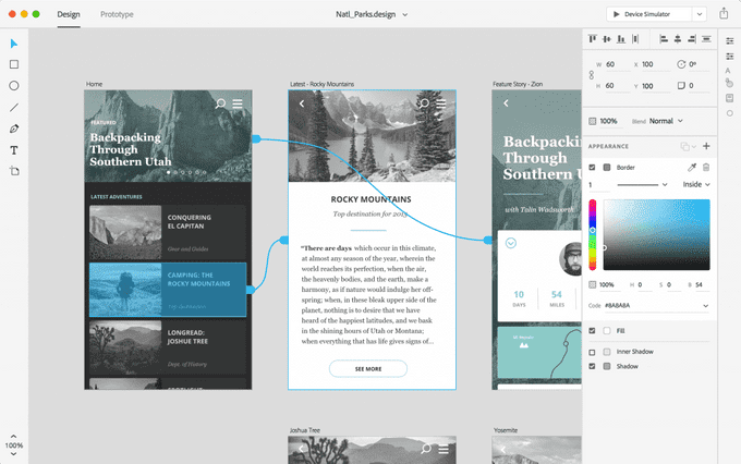
For example, Once we design all the individual pages of our web app, we will need to connect the pages in the way that we want the end-user to access it. The adobe xd allows us to connect one page to another by simply dragging a curvy arrow across the artboard, connecting the source page to target page.
Bid adieu to copy paste
The new 'Repeat grid' feature saves the developers the pain of copy pasting. In previous years whenever the application had repeated elements such as boxes, the elements had to be copy pasted while carefully preserving the spacing between the items. Those days are gone. The adobe xd allows the developer to repeat the elements using the repeat grid.
Keep it simple stupid!
The simplicity of new UI of adobe xd is one of its greatest strengths. The simple greyscale UI with its minimalist icons makes the designing process simpler and effective. This fundamental difference would give the adobe xd a big mileage in the competitive market.
So what's the catch?
Though all the above features paint a rosy picture, the truth is that there is no perfect software in the world. Every new tool has its own set of shortfalls. Let us see what the critics of adobe xd are claiming
Limited Prototyping Feature
Though prototyping within your design application is a great advantage in terms of usage, the adobe xd does not contain all the features of a full-fledged prototyping tool such as invision.
Hex code
The simplistic user interface is really good to work with but some of the most important features are missing. For example, the colour picker looks really good until you click on it to find out that the option to enter the hex code is missing
Adobe XD Vs Sketch: The verdict
Sketch has remained as the most popular designing tool for quite some time now. There are a number of features that make it the favourite of many UI developers. The years of existence in the market and the number of modifications has made sketch a mature software that can actually aid in the making of great user experiences. Since it is specifically designed for developing UI it was able to successfully overcome the limitations of its predecessors such as adobe photoshop. The lack of subscription model also makes it really beneficial to a lot of developers.
On the other hand, the Adobe xd is a new software that has been ambitiously placed as the one stop solution for all designing needs. The excruciating effort of the adobe team has paid off and the product has met most of its expectations. But with its simplistic approach and lack of some advanced features, it rather feels as a UI tool for beginners. With time and few modifications, the adobe xd has the potential to be the ideal competitor for the well-established sketch.
Got a chance to try Adobe XD? Have your own thoughts or opinions on the topic. Feel free add them to the comments section and let us discuss.

